Designing a Major Project Using an Analog of Alibaba.com
- Page: Item Card
- Page: Service Card
- Page: Advert
- Page: Home
- Page: Catalog. 3rd Level
- Page: Catalog. 1st Level
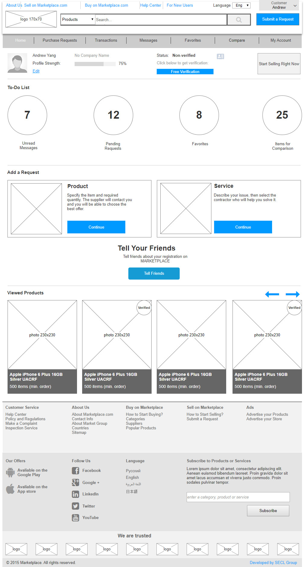
- Page: Buyer
- Page: Ordering
- Page: Messages
- Page: Compare Products
- Page: My Products
- Page: Transactions
- Page: Supplier Contacts
- Page: My Profile
Much has been said about designing a project: how to use Axure or Sketch, what functions the website should contain, how to properly design the product page. Of course, this is all very useful, but it doesn’t give us the complete picture of what’s happening at the UX/UI design stage. The Internet doesn’t provide us with a single complete example of a technical specification for these types of projects. In fact, to design a major website, you need to spend hundreds of hours researching, prototyping, and developing detailed technical specifications. In this article, I’ll show you all the stages of UX/UI design and the results, a complete dynamic prototype (more than 150 prototypes), and important specifications (more than 200 pages of description). We propose to do this by designing an analog of the world’s largest e-Commerce platform — Alibaba.com.
Smart people will immediately start talking about the minimum viable product (MVP) and technical specification containing hundreds of pages. In fact, the design doesn’t interfere but actually helps with the creation of the MVP. If we work the Agile way and move towards MVP, we can either design in pieces, or design the whole system, but break it down into stages. It’s important for the UX/UI design stage to actually take place and not have to be redone many times.
Since we’re creating an analog of an operational and successful website, we won’t need many stages or they’ll be minimal, namely gathering requirements, setting up project and customer objectives, the target audience and the personas, studying competitors, and defining tasks-problems-solutions, the Mind map and website structures. We just need to study the analog. In principle, for convenience, you can draw up a Mind map and site structure, but that’s only if you want to do it… but you can get by very well without them.
Behavior Scenarios
This is an important and relatively easy stage. We’ll need many user behavior scenarios. In conjunction with dynamic prototypes, they’ll help us detect errors that will inevitably slip through the cracks when we’re developing interfaces and connections. We’ll need end-to-end scenarios for the entire website and small scenarios for each individual page in order to check its functionality and usability.
We can come up with scenarios through analogs; that’ll be the easiest way. As we’re creating an analog and not a copy, functionality will differ slightly from the original. So, we mustn’t forget this when creating the scenario, and we should exclude that functionality from the scenario and use the unique one in the scenario.
Dynamic Prototype
After studying the analog, we can start modeling and creating a dynamic prototype. You can create the design in sections and it usually starts with the product card — the most important page that contains a lot of links (if it’s about e-Commerce; for other types of projects you need to start from other pages). So, we used a special program called Axure, which allows us not only to design interfaces but also to create a dynamic prototype, without which the design would be incomplete. Since this is a very large project, we numbered all the prototypes and created nesting. When a project has tens and hundreds of layouts, it’s easy to get lost without such nesting. The source file turned out to be very large; therefore, we divided the source into several parts while retaining the numbering, so that when moving into the dynamic prototype, we wouldn’t be confused by the incomplete list of pages on the left. There are four such files.
Not all UX/UI designers are ready to work on dynamics as it’s time-consuming even if they have already developed many others (ready-made standard interface dynamics that all experienced UX/UI designers have). After all, simply creating static interfaces and bringing them to perfection is tremendous work, considering that there are more than a hundred of them in a project of this size. But, don’t forget… this is not only an important part of the project but also an integral part of good UX/UI design. The larger the project, the more links, transitions, pop-ups, and other non-obvious functions it has. Therefore, even the most experienced UX/UI designers can’t remember everything. A dynamic prototype is needed to drive out user scenarios, and moreover, you need to see that nothing’s been forgotten and check that there are no logical errors. If you work on statics only, you’ll have to redo/complete the design, layout and programming many more times. Therefore, it’s better to catch all these ‘bugs’ at the first stage than spend too much time and money on redoing everything later on.
We were lucky! Not only did we have ready-made interface dynamics, but also many other developments, namely in e-Commerce and the marketplace that we specialize in. Therefore, it’s easier for us to work on such things than do everything from scratch. Even if we considered all the developments, it took hundreds of hours of work to complete. But, this guarantees that our work will proceed normally in the next stages.
I’ll post the prototype itself and dynamics at the end of the article; it’s very big! I’ll show only the main pages in the article, and you’ll be able to see how much work was dedicated to dynamics and specifications.
QA
So, now the prototype is ready together with the behavior scenarios. But, no matter how experienced the UX/UI designers, they are bound to miss, forget or ignore something. That’s why we have quality assurance/control — QA. This is a standard stage for development, but very few people use it in UX/UI design. The layout and software are usually tested, but no one thinks about UX/UI design. This would all amount to nothing, but, as I mentioned above, mistakes made in UX/UI design will show up in further developments and everything will need to be redone. So, the earlier the error is made, the costlier it is for the project.
Quality assurance is quite simple to apply: the QA Engineer, who has a lot of user experience and knowledge of the subject, looks through all the layouts, clicks on every link, and keeps track of all the elements. If something isn’t clear, he/she should ask the UX/UI designer. If something’s missing or illogical, he/she will have it revised/redesigned. If internal standards for interface design aren’t met, he/she will also have them revised. It’s namely this specialist who won’t allow errors to slip through the cracks. In order not to miss anything and achieve an intuitive interface, we apply the same user scenarios that we developed earlier.
Later, the QA expert will also check the technical specifications, but this should be done for compliance with quality standards and to check whether everything has been included in the technical specifications. Therefore, QA is used twice during this stage in order to check different materials. As practice shows, QA finds a lot of discrepancies in the process, but in the end, the prototype and technical specifications will be quite well worked out. There will be minimal errors at the next stages, and less time devoted to redoing certain things.
Technical Specifications
Having developed a complete prototype and all the pages for the website, we can start creating technical specifications. We need to describe all the non-obvious interface layouts. We have a dynamic prototype, all command buttons and links work properly, but even this won’t help us with further development, so we really need a description for our interface. In addition to describing the interface, technical specifications must contain other requirements that will be worked out by the whole team.
Special requirements in technical specifications:
1. Site architecture is developed by the architect
2. Load requirements are developed by the architect and team leader
3. Servers and infrastructure are developed by the system administrator, architect and team leader
4. Safety requirements are developed by the security specialist and team leader
5. SEO requirements are developed by the SEO specialist and Internet marketer
6. Design requirements are developed by the designer
7. Layout requirements are developed by the layout designer
8. Micromarking is developed by the layout designer
9. UML and robustness diagrams are developed by the designer and programmer
10. Access rights differentiation is developed by the UX/UI designer
Example of an access rights table in the project:
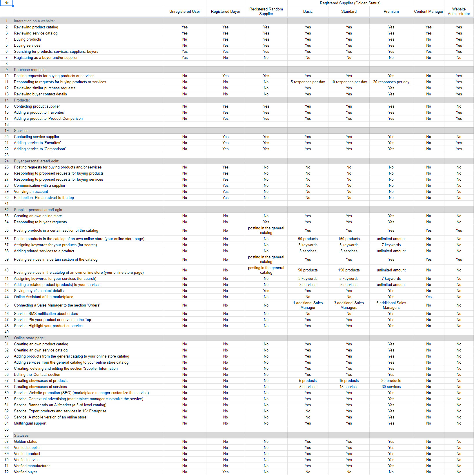
These take up whole sections of the technical specifications. If we fail to work out at least one item, we’ll have problems at the next stages and have to redo everything. I think almost everyone has run into a particular situation when the site starts crashing at some point, or is hacked, or loads of changes have to be made in SEO, or layouts have to be modified, etc. This is all due to underdeveloped UX/UI design and incomplete technical specifications. Therefore, it’s much cheaper to think the system through immediately and correctly than spend money on incorrect implementation, incur losses, waste money on audits and recommendations for improvement, and in the end, have to redo the installation anyway.
Simply put, correct technical specifications are the key to project success and the foundation for the entire project. To illustrate the scope of work, I’d like to show you the description of the project interface: the description of the Marketplace.com interface. I must point out that this doesn’t refer to all the technical specifications. Many blocks listed above aren’t there. However, different teams work differently; in particular, we work on some of the requirements described above at later stages. For example, the architecture is done at the programming stage and constitutes a separate document, but we begin discussing and thinking about it at the UX/UI design stage so that we don’t design an absolutely unrealizable product. It’s neither the development stage nor the document where results are reflected that are so important, but more the fact that we shouldn’t forget to do it.
Of course, it’s not fatal if the project has already been created and the above-mentioned items haven’t been worked out. It’s always possible to conduct an audit in an area and finalize it. As they say, better late than never! We’ve seen that almost every marketplace or online store has some shortcomings, which are often revealed in audits. More often than not, problems related to interfaces and SEO constitute an important part in similar projects. All projects either maximally lay out the items I described in technical specifications, or arrive there in an evolutionary way. But both can be there!
Here’s an example of a projected analog of Alibaba.com (main pages):
Page: Item Card
Prototype: https://6o6uwg.axshare.com/#g=1&p=1_0_0_0_items_card

Page: Service Card
Prototype: https://6o6uwg.axshare.com/#g=1&p=2_0_0_0_service_card

Page: Advert
Prototype: https://6o6uwg.axshare.com/#g=1&p=3_0_0_0_advert_card_item
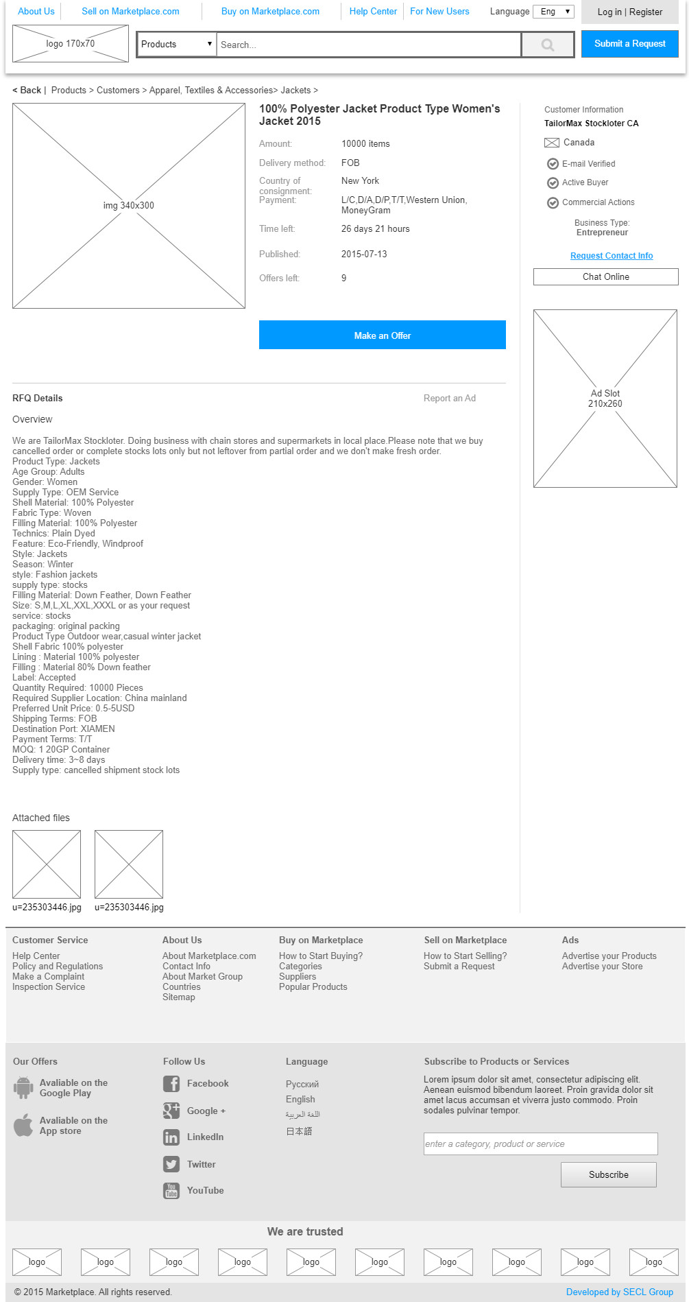
Page: Home
Prototype: https://6o6uwg.axshare.com/#g=1&p=4_0_0_0_home_page

Page: Store
Prototype: https://6o6uwg.axshare.com/#g=1&p=7_0_0_0_store

Page: Item Search
Prototype: https://6o6uwg.axshare.com/#g=1&p=8_0_0_0_search_items

Page: Catalog. 3rd Level
Prototype: https://v9uojn.axshare.com/#g=1&p=10_0_0_0_catalog_3rd_level_items

Page: Catalog. 2nd Level
Prototype: https://v9uojn.axshare.com/#g=1&p=11_0_0_0_catalog_2nd_level_item

Page: Catalog. 1st Level
Prototype: https://v9uojn.axshare.com/#g=1&p=13_0_0_0_catalog_1st_level_item

Page: Catalog. All Categories
Prototype: https://v9uojn.axshare.com/#g=1&p=15_0_0_0_catalog_all_items

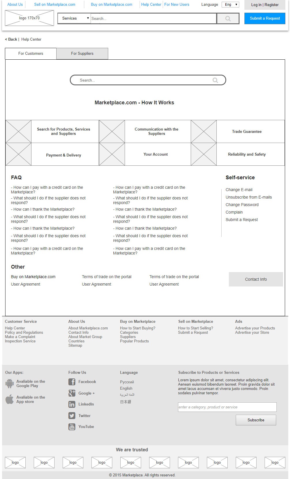
Page: Help Center
Prototype: https://v9uojn.axshare.com/#g=1&p=17_0_0_0_help_center
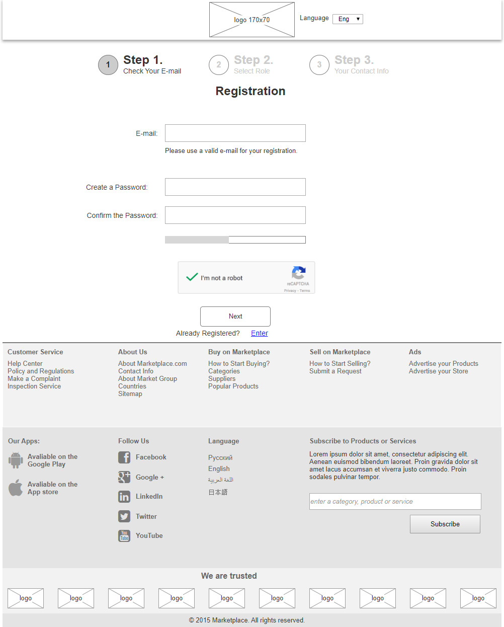
Page: Registration. Step 1
Prototype: https://v9uojn.axshare.com/#g=1&p=19_0_0_0_registration_step_1
Page: Buyer
Prototype: https://i47f3o.axshare.com/#g=1&p=20_0_0_0_buyer
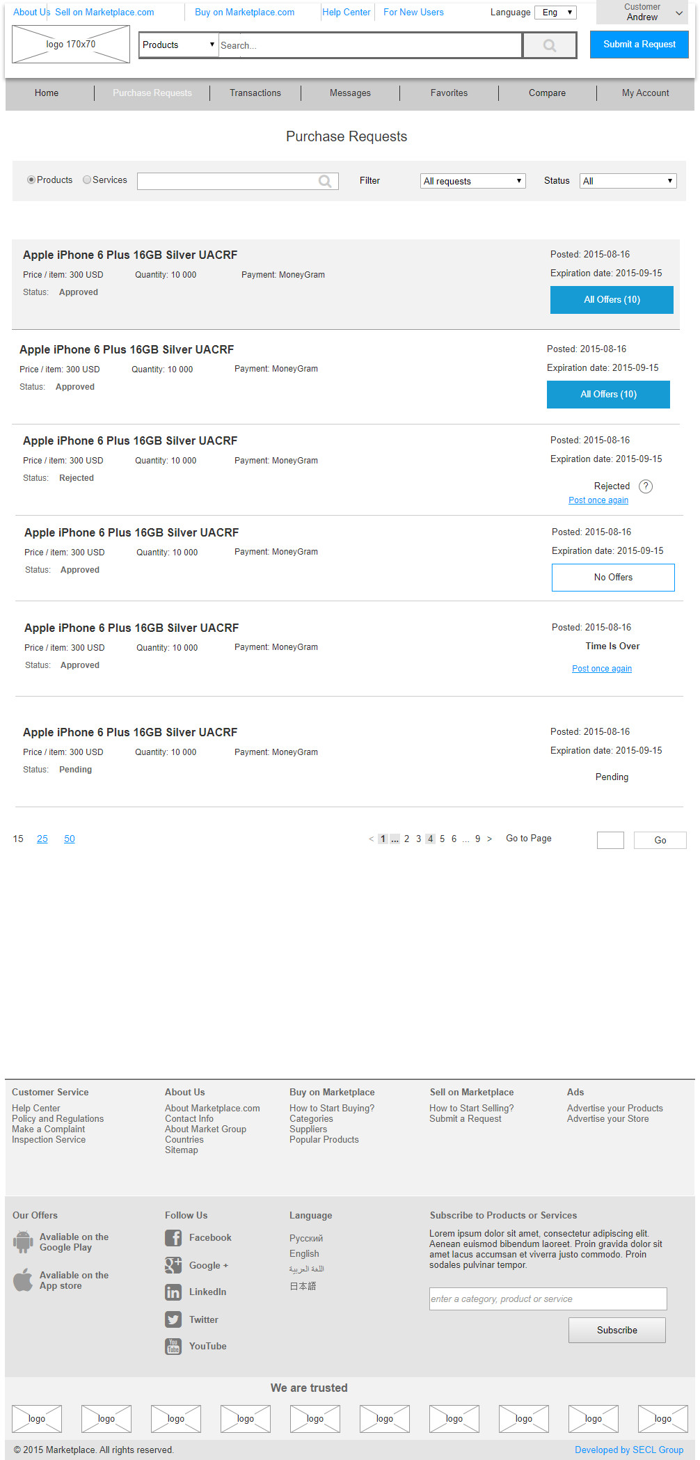
Page: Purchase Requests
Prototype: https://i47f3o.axshare.com/#g=1&p=20_1_0_0_purchase_requests
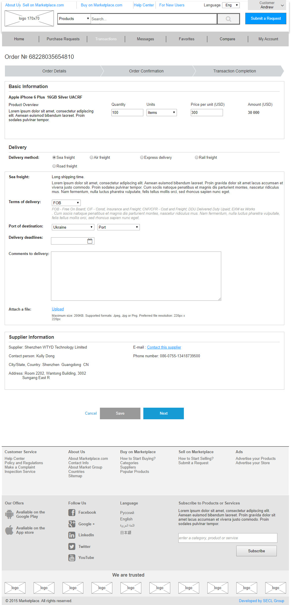
Page: Ordering
Prototype: https://i47f3o.axshare.com/#g=1&p=20_2_0_0_place_order
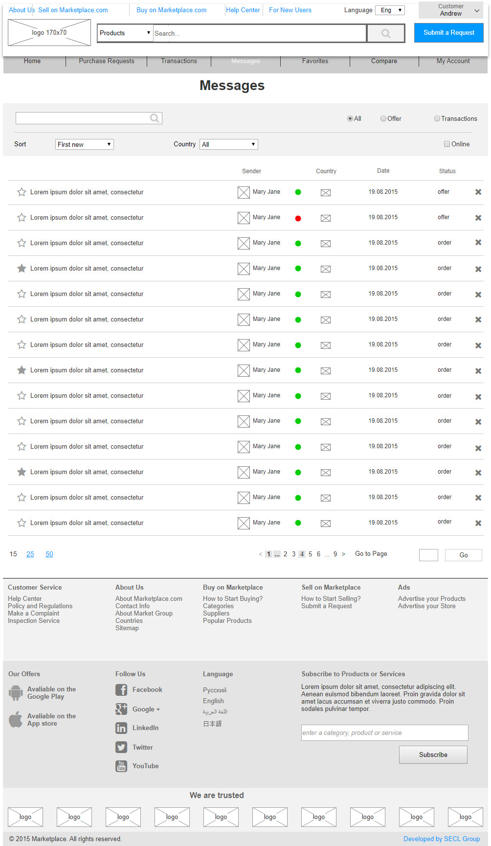
Page: Messages
Prototype: https://i47f3o.axshare.com/#g=1&p=20_3_0_0_messages
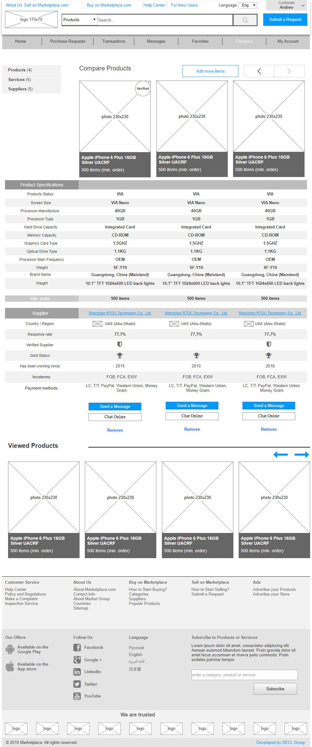
Page: Compare Products
Prototype: https://i47f3o.axshare.com/#g=1&p=21_0_0_0_comparison
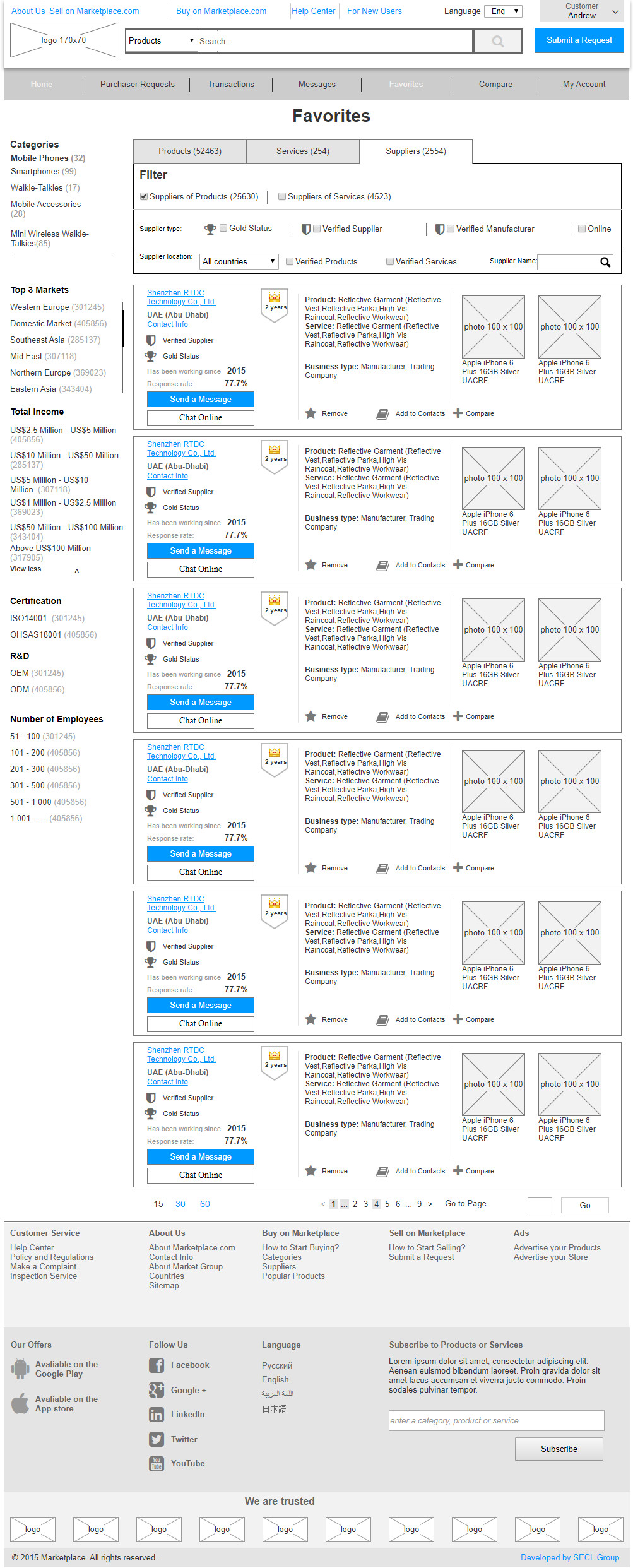
Page: Favorites
Prototype: https://i47f3o.axshare.com/#g=1&p=21_0_0_0_favorites
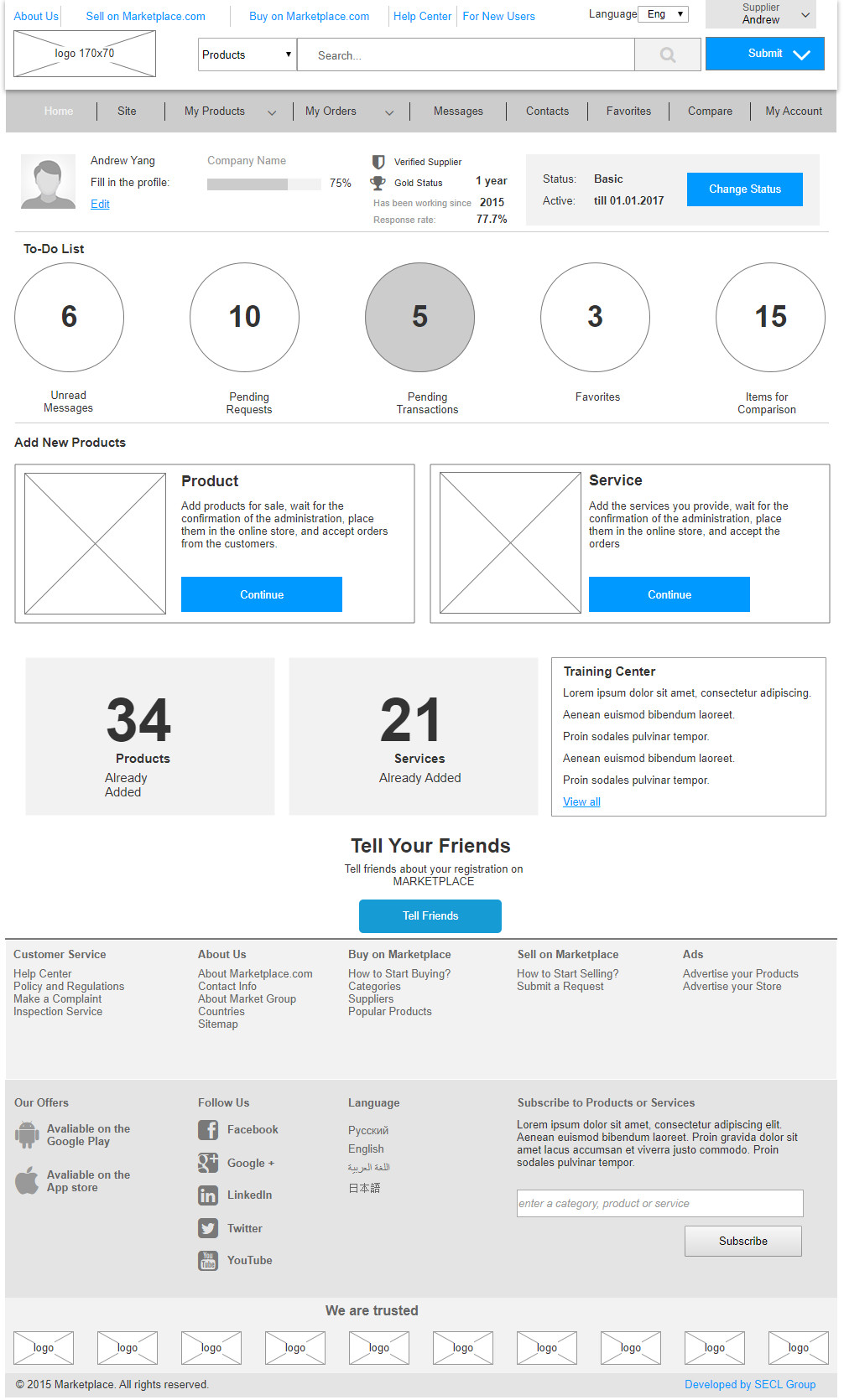
Page: Supplier
Prototype: https://xpqmrv.axshare.com/#g=1&p=22_1_0_0_supplier
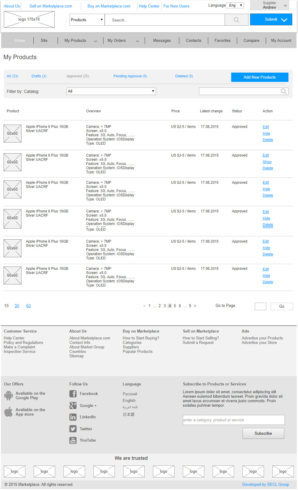
Page: My Products
Prototype: https://xpqmrv.axshare.com/#g=1&p=22_2_2_2_my_products_items
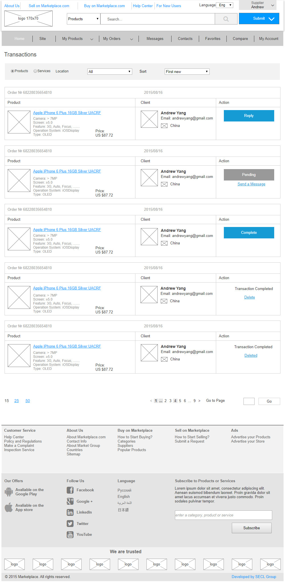
Page: Transactions
Prototype: https://xpqmrv.axshare.com/#g=1&p=22_4_1_0_transactions
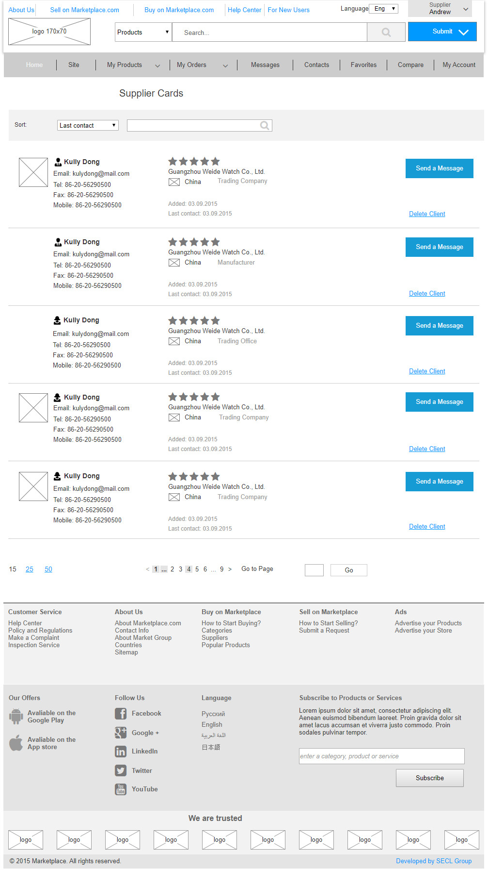
Page: Supplier Contacts
Prototype: ttps://xpqmrv.axshare.com/#g=1&p=22_6_0_0_contact_info
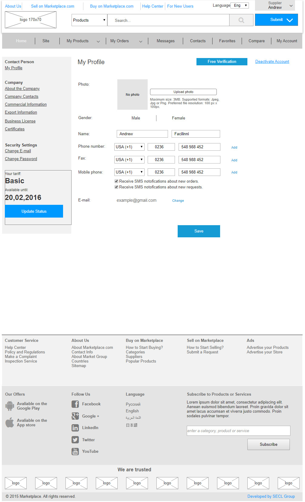
Page: My Profile
Prototype: https://xpqmrv.axshare.com/#g=1&p=22_7_0_0_account
Summary
A person that’s not too familiar with project development might be overwhelmed by the scope of work, but experienced UX/UI designers who’ve designed a marketplace or a large online store will realize that we haven’t mentioned everything. In this project, we didn’t show the admin area, which is no less complex than the external site, nor did we show the design of the adaptive version, which needs to be designed separately (for the sake of economy, the layout designer works on the adaptive version individually, but it shouldn’t be so). Specifically, this marketplace was created by an expert who’s designed more than 30 different marketplaces and online stores; therefore, links, pop-ups, logic and other elements are well worked out in this case. But, the good word is that despite the huge amount of accomplished work, we need to continue working more on design, meaning that we don’t recommend taking and using the prototype the way it is.
Project managers and designers are launching many projects without going through the UX/UI design stage. This leads to endless reworking and a huge waste of money. I’ve personally launched several projects, and like everyone else, I tried to do without designing several times. After such experiments, I often recalled a wise proverb: ‘I’m not rich enough to buy cheap things!’ The significance of this statement can really be applied to working with or without UX/UI design. On the one hand, knowing how much work must be done, we tend to think of UX/UI design as somewhat expensive. On the other hand, if we try to launch something large and complex without UX/UI design, we’ll end up spending much more time and money redoing what we’ve just completed.


